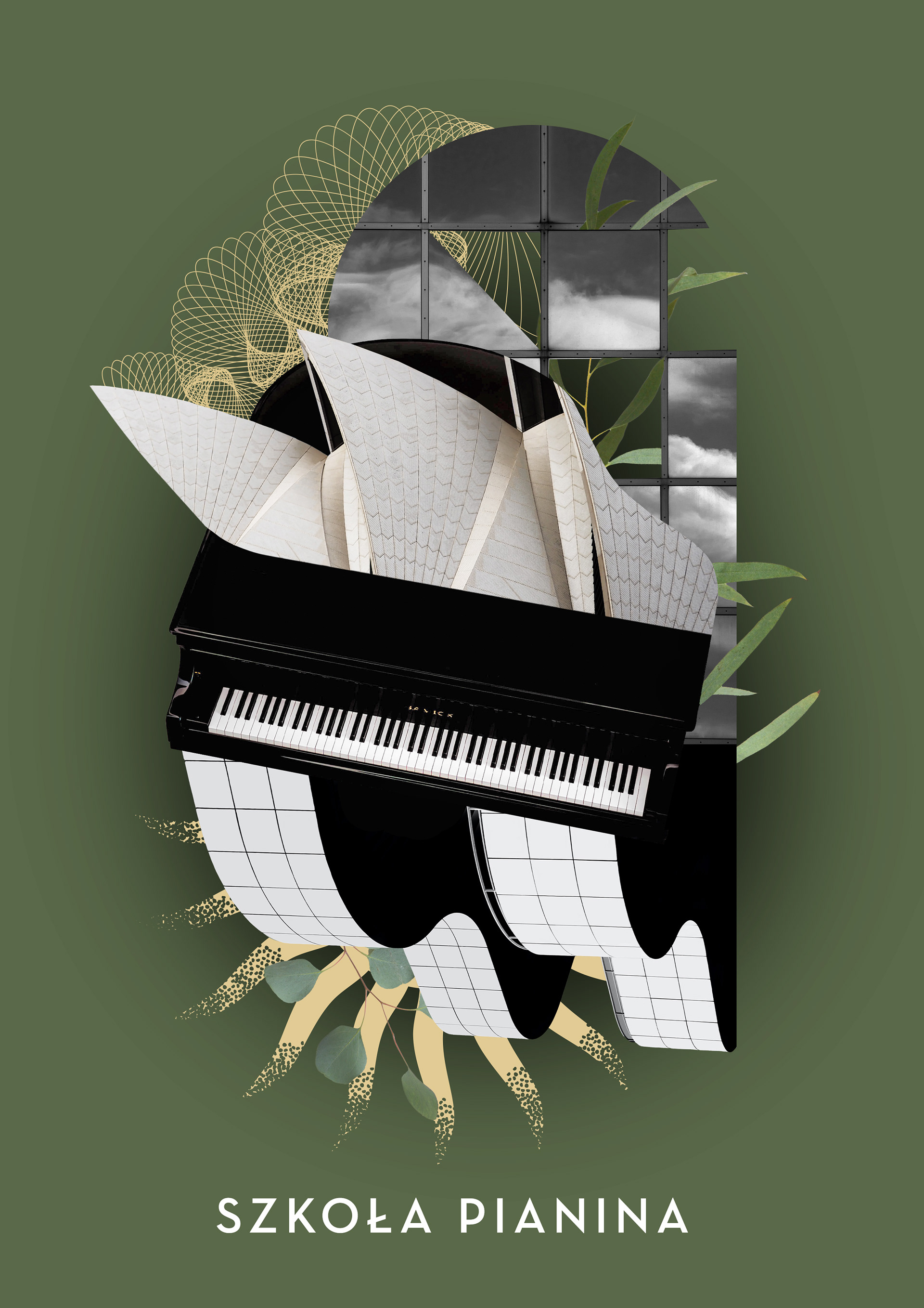
For the Piano School, I created a binder for sheet music
and the cover of the book "Quick Note Reading".
and the cover of the book "Quick Note Reading".
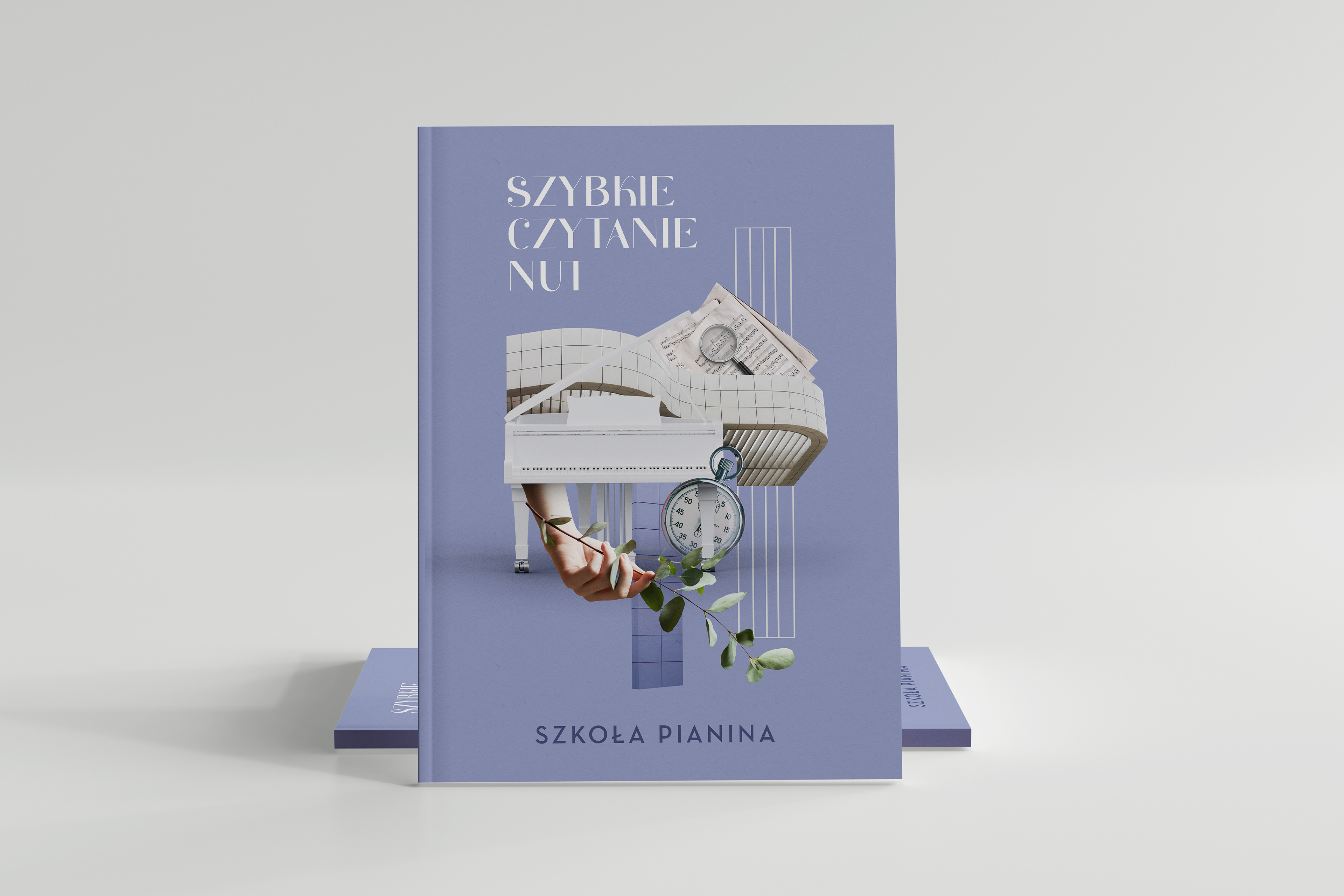
Okładka książki "Szybkie czytanie nut" (mockup)
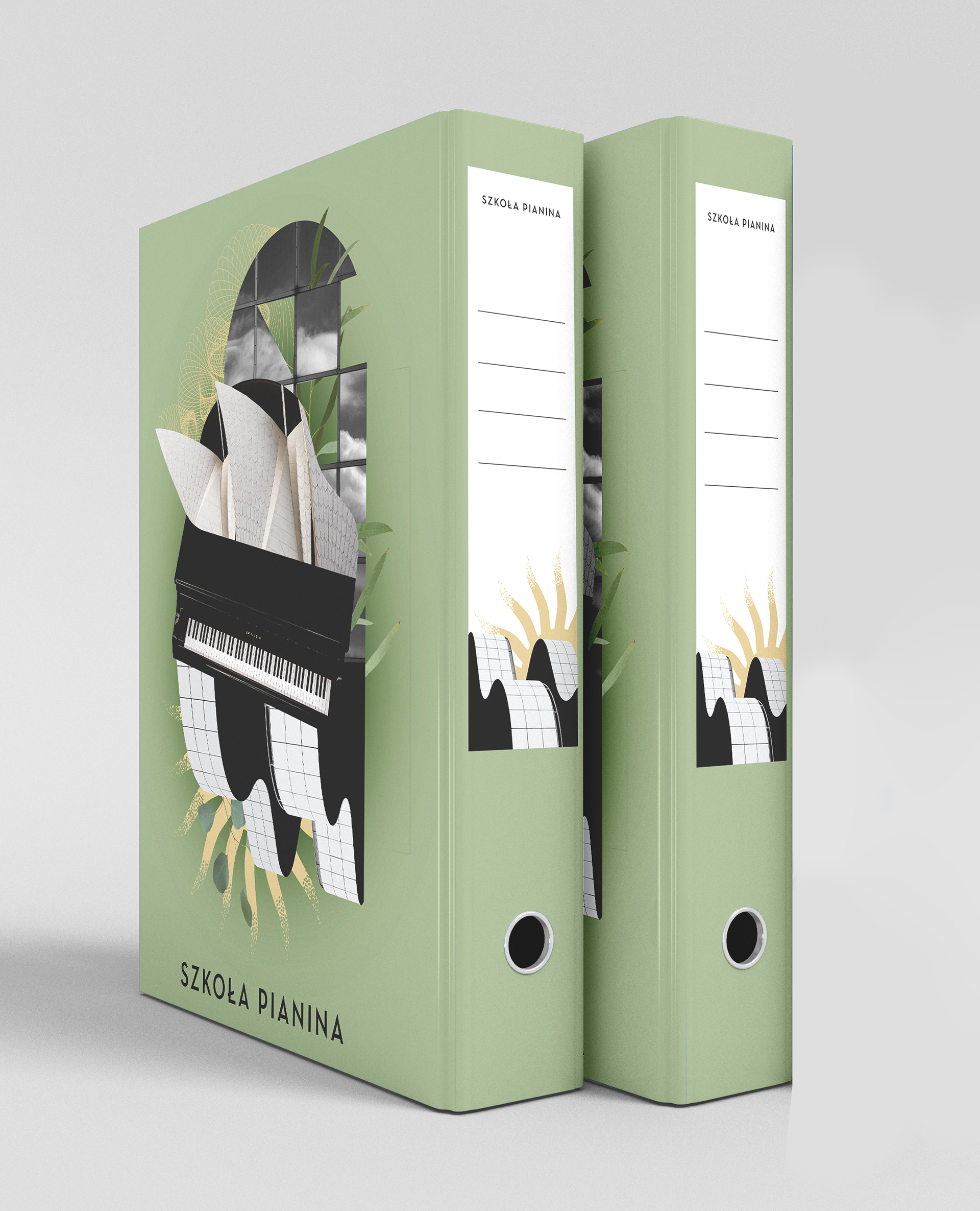
Segregator na nuty (mockup)
The cover of the book as well as the binder were kept in the same style. There had to be elements directly associated with playing an instrument - hence the piano. An additional graphic element repeated in the graphics is architecture, bringing to mind rhythms in music. An element from nature, such as eucalyptus, is also replicated.
It was important that both graphics be universal in terms of purchase
by both men and women.
It was important that both graphics be universal in terms of purchase
by both men and women.
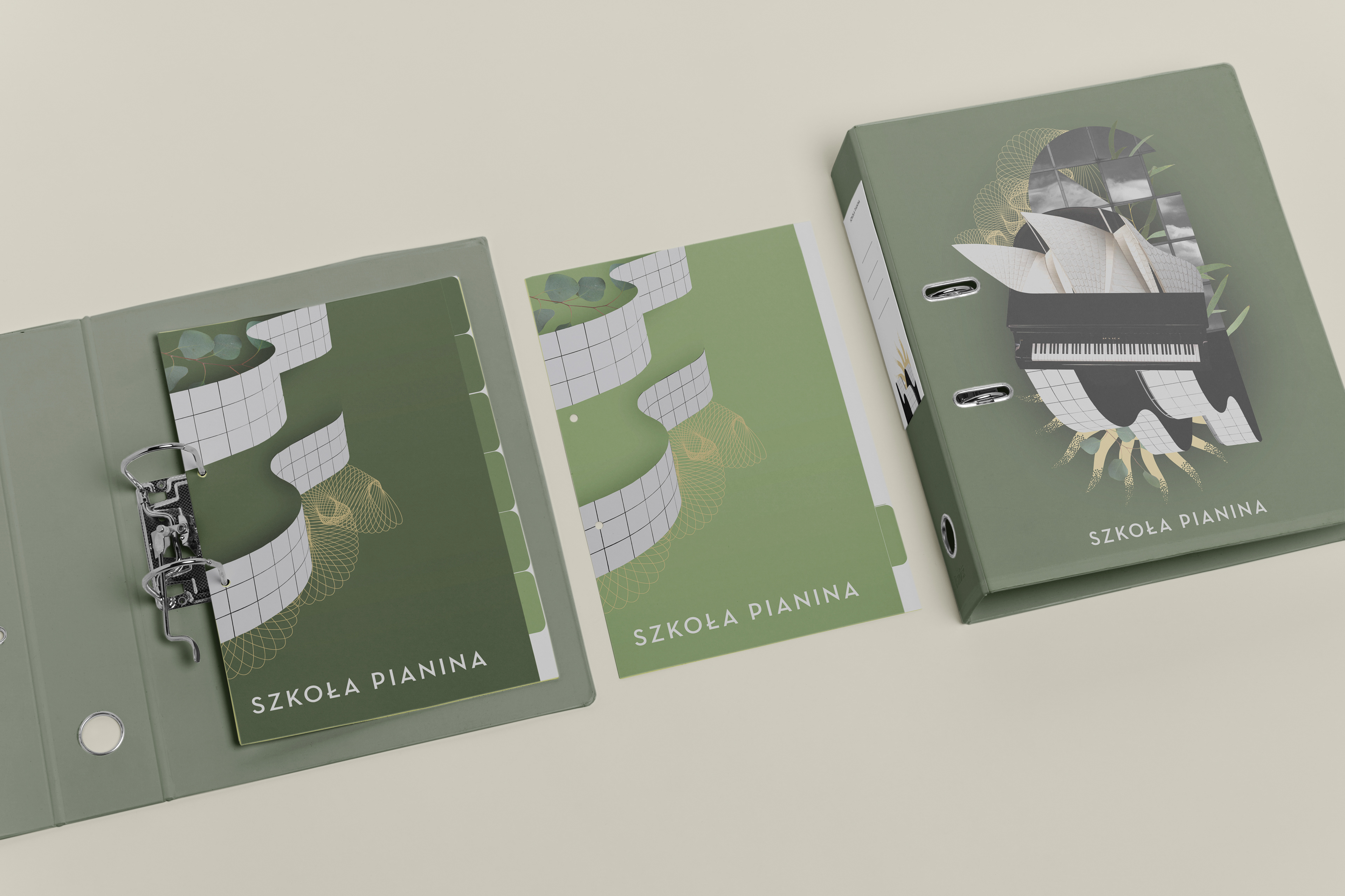
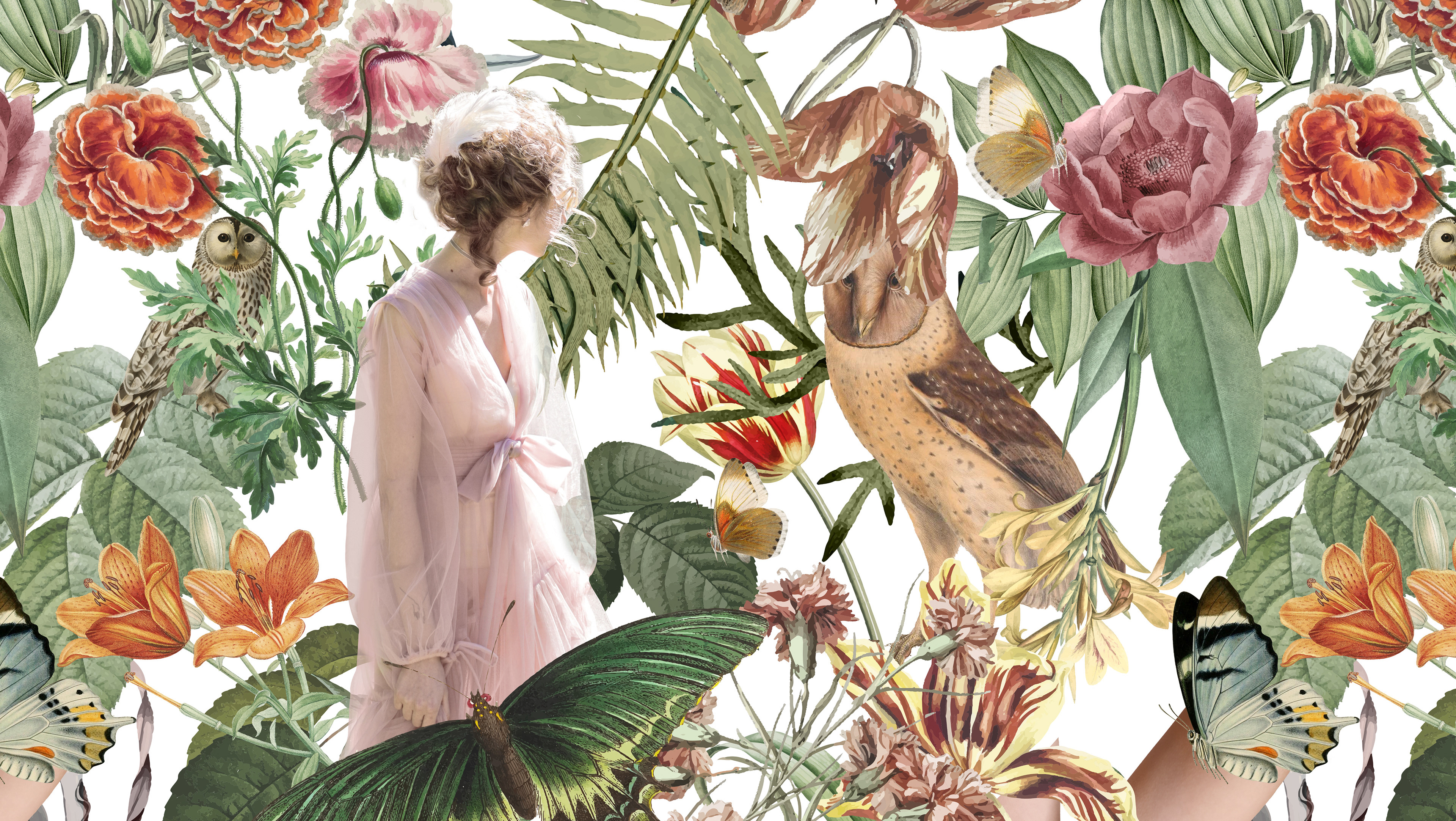
Wewnętrzne zakładki oraz okładka segregatora (mockup)
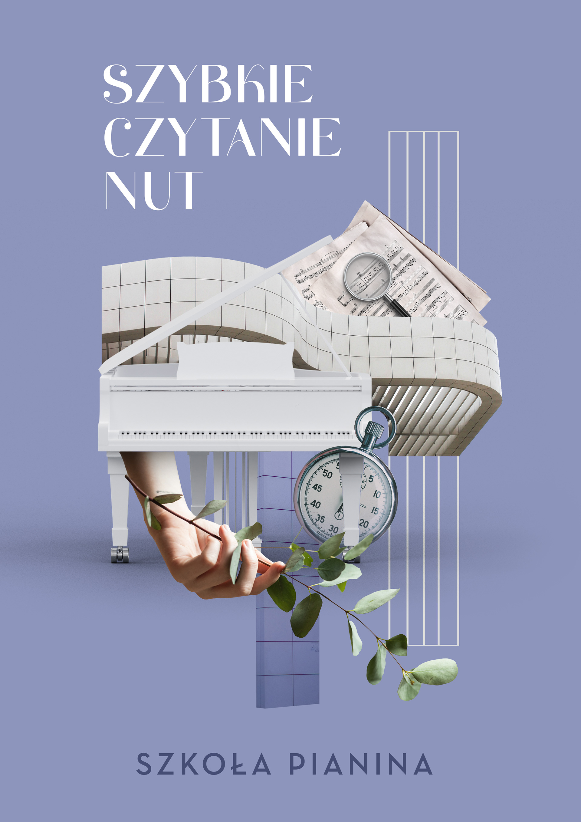
Projekt okładki książki "Szybkie czytanie nut"
